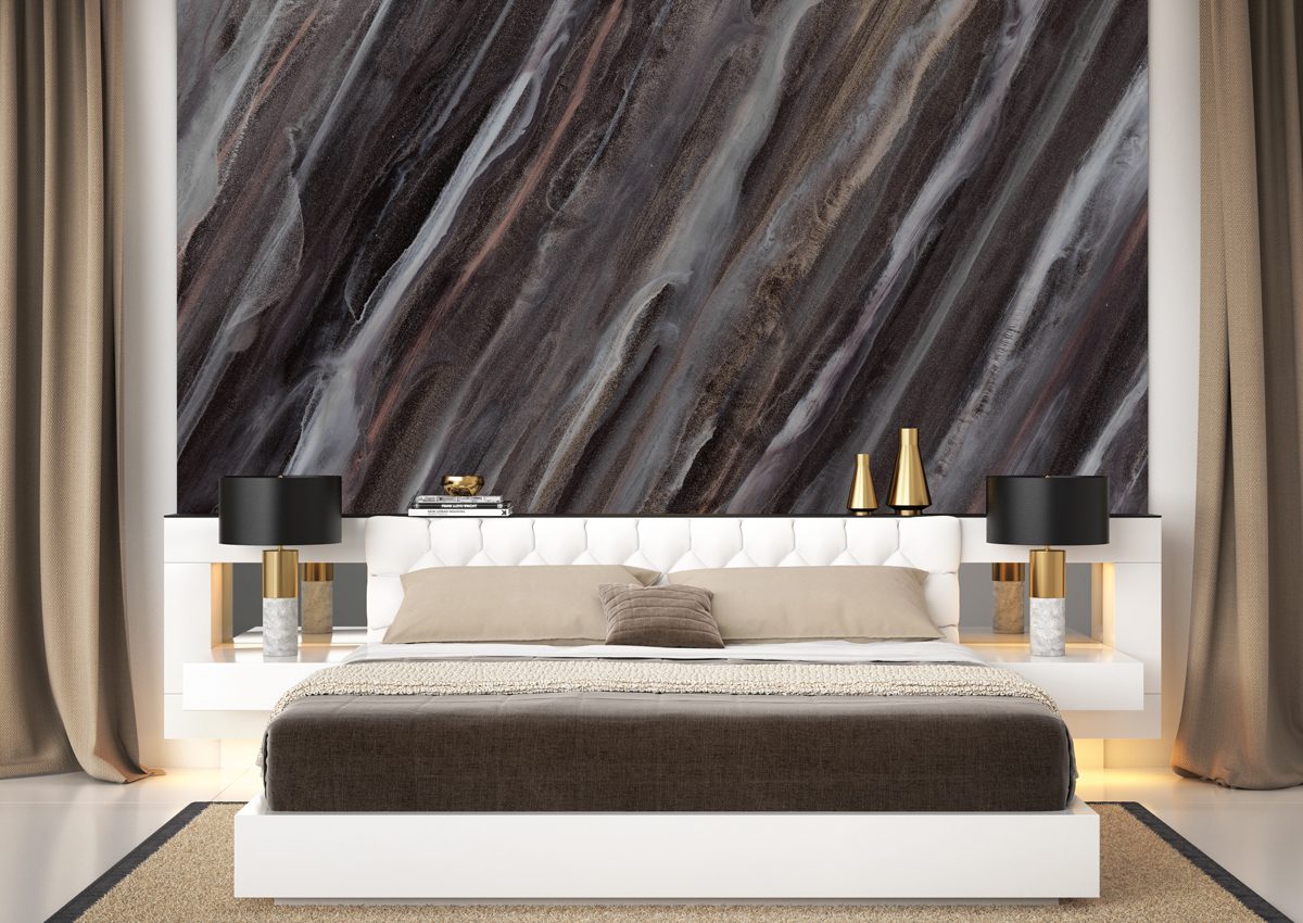
Abstraction finds its roots in intuition and freedom. The digital era has spawned a whole vein of abstract design. Intense colour with mathematical plays of pattern and abstraction. A reflective mylar substrate provides additional impact | Order Samples | Request A Quote | For custom colors.. Contact Your Rep |
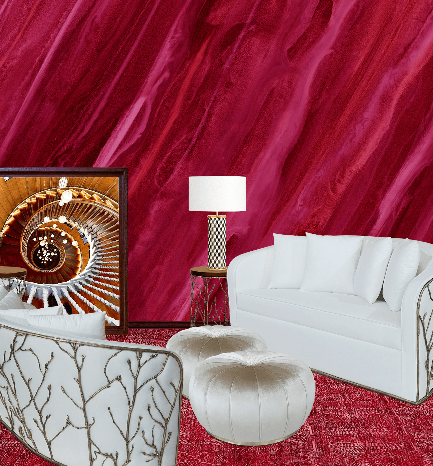
The color of passion and drama, associated with strong emotions such as love, Red is one of the top two favorite colors of all people. Regardless of how it is used in a design, a little bit of red goes a long way.
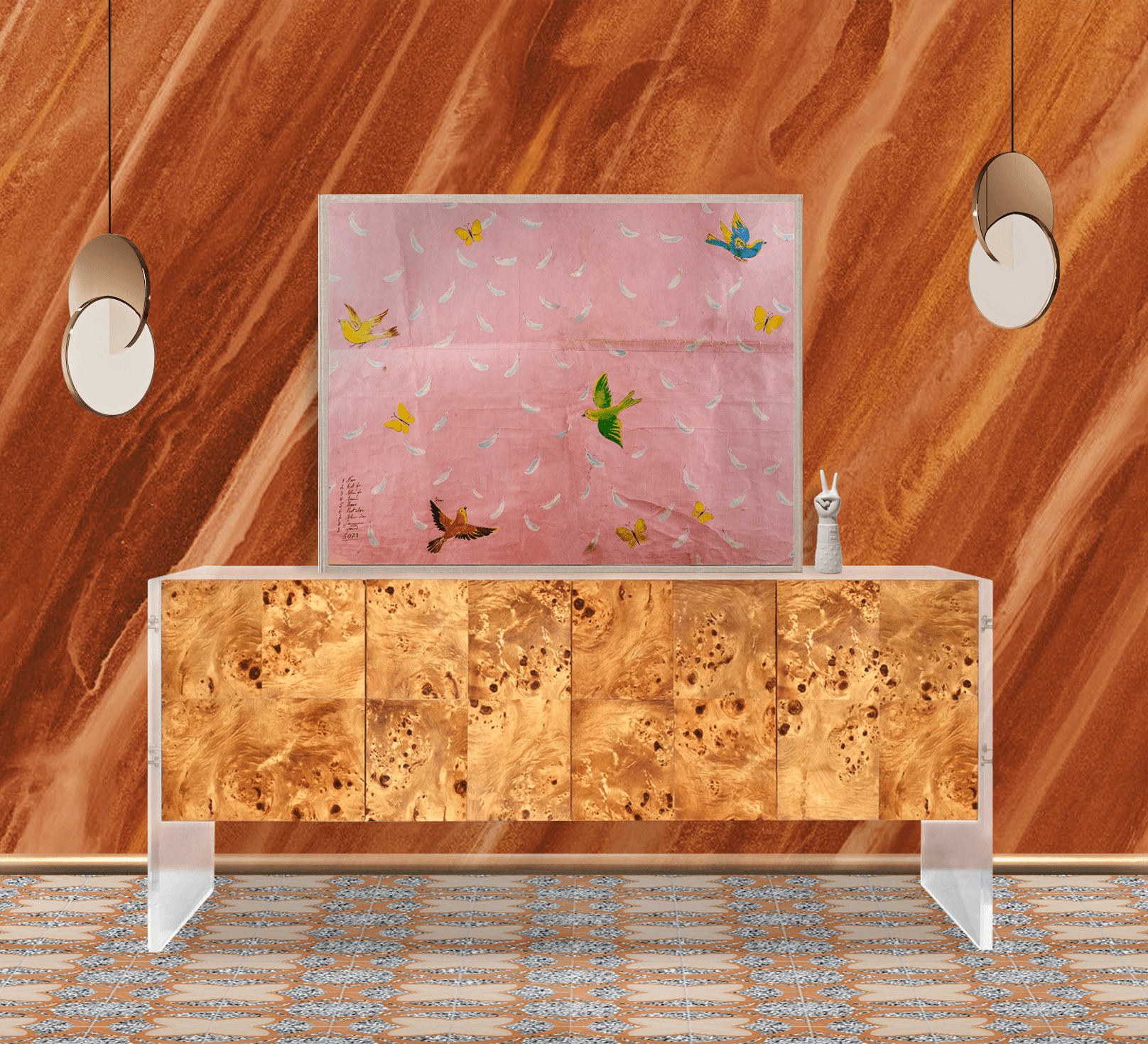
Orange is the color of joy and creativity. It is associated with warmth, sunshine, enthusiasm, change, determination, happiness, and fun.
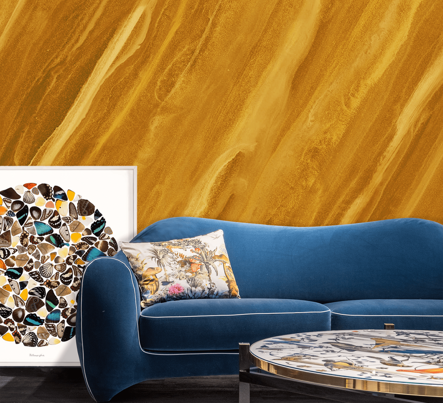
The color yellow is considered to be the happiest color in the whole color spectrum. It’s stimulating positive feelings. However, studies show that people are more likely to lose their temper in an all-yellow interior, so it should be used sparingly.
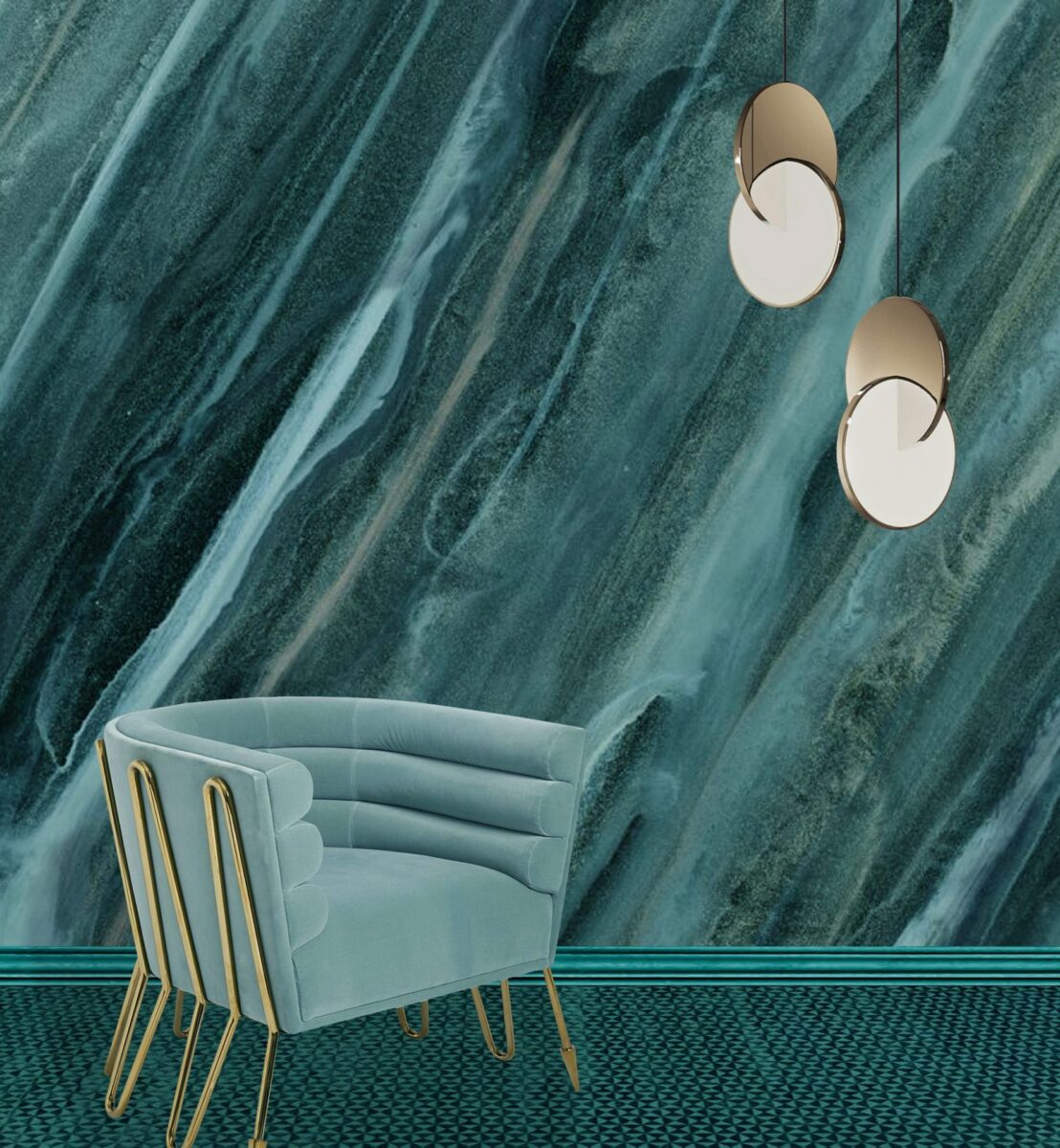
Think of nature and see green in all its glory expressing renewal and life. Green has a strong association as a refreshing and peaceful color. Being the combination of yellow and blue, it is both optimistic and calm.
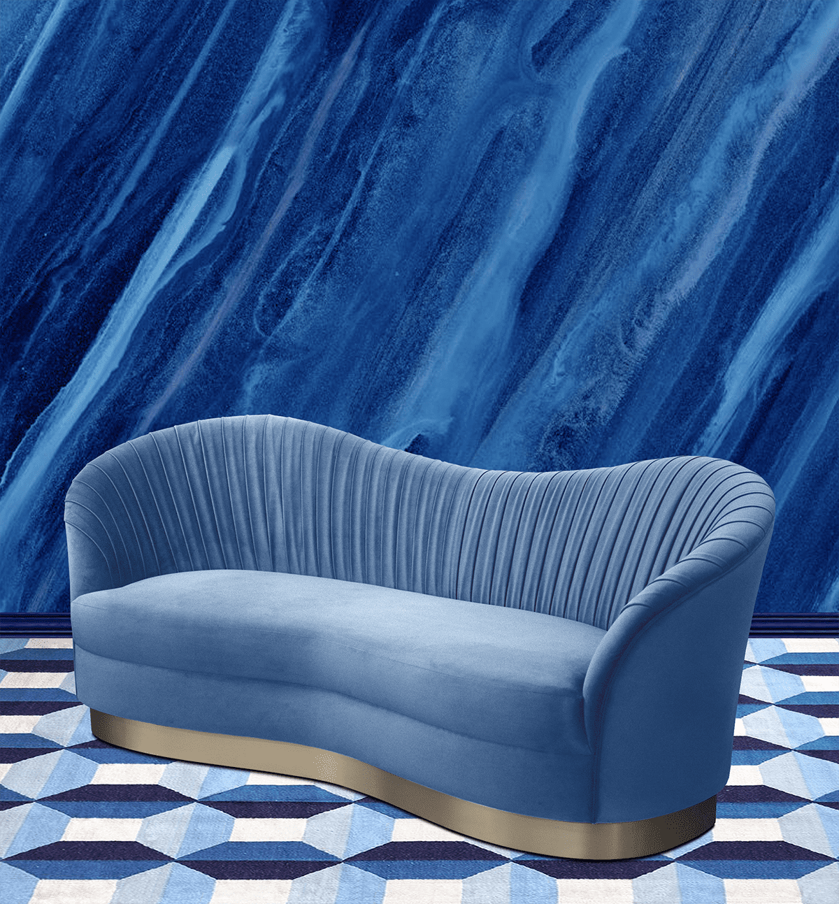
The color blue has positive affects on the mind and the body. Blue monochromatic interiors promote serenity. Since only one hue is used, the color and its variations are guaranteed to work.
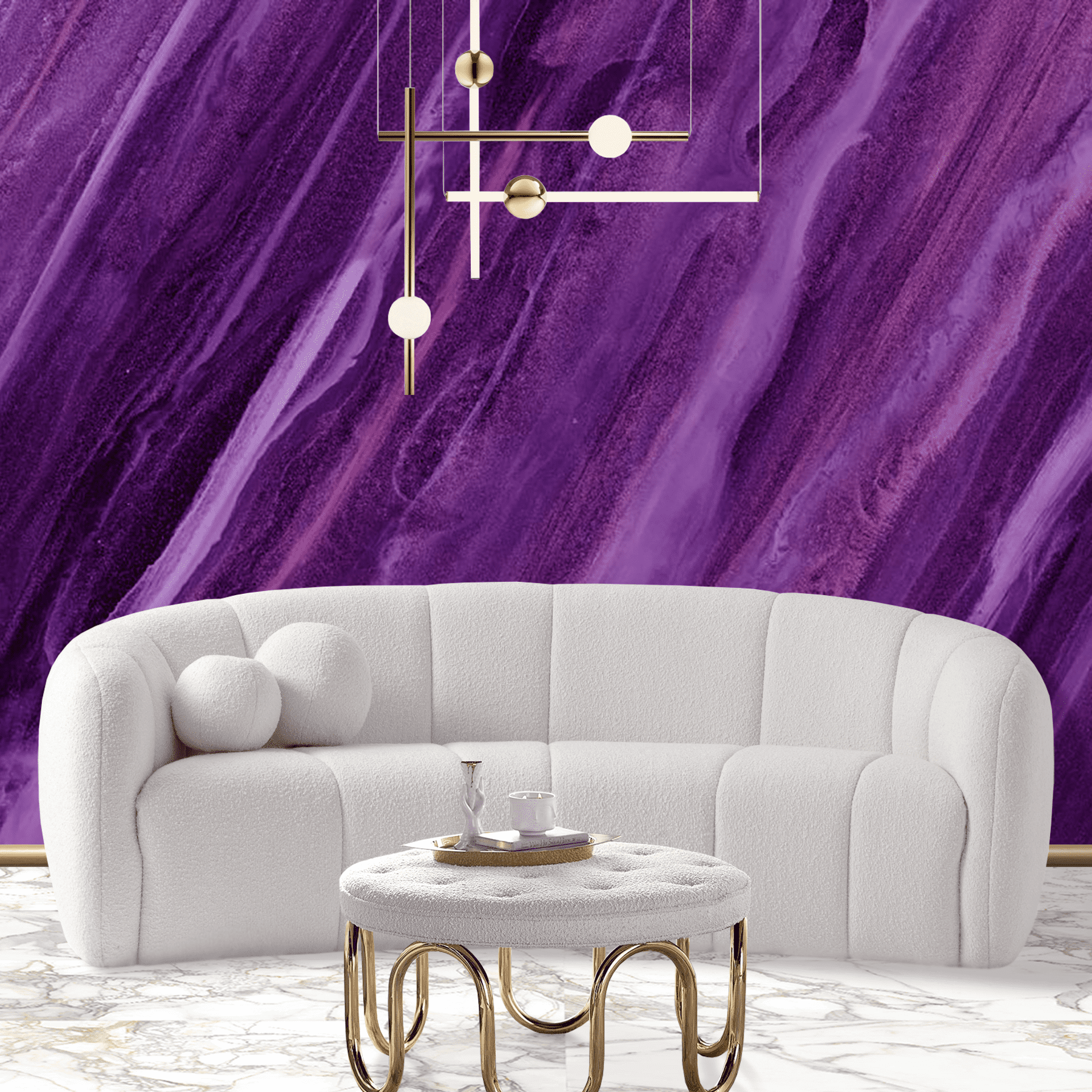
Violet color fields communicate nobility, wisdom, strength and encouraging meditation. Leonardo da Vinci proclaimed that you can increase the power of meditation ten-fold by meditating under the gentle rays of Violet.
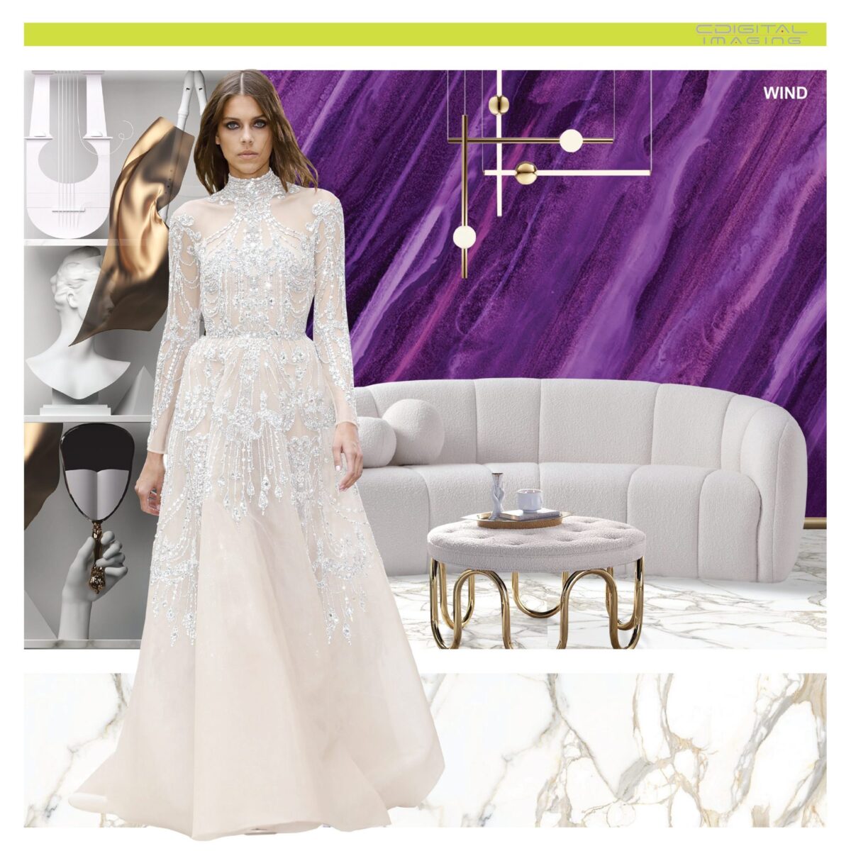
#DesignInspiration Wind by CDigital ✨🕊 CDigital donates a percentage of sales proceeds to organizations that support preservation and habitat restoration of endangered wildlife around the world. 🌍
Whitney Estep
I love everything about this pattern & content! ❤️🧡💛💚💙💜🖤🤍🤎